MICHELLE LANCASTER
Graphic Design & Illustration
Concert Series Poster Design
2022
A professional project to design a stylistically cohesive series of promotional designs for use across different platforms. For this project I began by researching the plot of each production, and communicating with relevant directors for both Theatre and Dance. Consistent elements of typography, a dominant background color, and illustrative elements visually unite this series. Each theatre poster contains visual metaphors related to main themes in the play. The pair of dance posters features photography from each production, digitally altered in Photoshop to appear painterly.
 |  |
|---|---|
 |  |
 |  |
 |
Book Jacket Design
2017–2019
A student assignment to create a minimal book jacket design for a series of three related books. For this project I chose notable Stephen King novels. Using iconic images from each story for reference, I created vector illustrations to feature against a minimal background. Related motifs are paired with each illustration to create visual interest across the entire book jacket. The color schemes revolve around tones with a high chroma accent color, evoking the books’ themes of horror. The covers, although somewhat variant, are cohesive overall as a matching set.
 |  |  |
|---|---|---|
 |  |  |
 |
Book Cover Design & Illustration
2019
A student project focused on integrating hand lettering into an art nouveau-inspired book cover for a work of classic American literature. The cover illustration features the story’s main characters and background elements from the setting. Bold outlines, earth tones, and organic, curvilinear shapes align with Art Nouveau style. Thus, a vintage aesthetic with modern minimalistic elements is created to curate classic literature and a historical style for a modern audience.
 |  |  |
|---|---|---|
 |
Research Report
2018
A student project to create a booklet outlining a research study of a how Lamar University students perceive typography. The research group and I gathered data through surveys and interviews, which I used to organized a comprehensive booklet. The booklet design integrates infographics, icons, and a written research report, and a bright color palette is used to capture and hold readers’ attention. Additional background graphics are created from manipulated letterforms, speaking to the report’s subject: typography. Thus, the small and easy to read booklet can effectively present research findings to the audience in a way that they can enjoy.
 |  |  |
|---|---|---|
 |  |
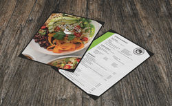
Menu Design & Restaurant Logo
2019
A self-guided branding exercise for a restaurant menu design and supporting elements. I re-imagined a less effective project to a health-oriented vegetarian café which would appeal to the emerging audience of the health food trend. A cohesive style featuring plant motifs and energetic high-chroma colors compliment the food-as-fuel focused brand, which is realized through a logo, menu layout, advertisement, and package design
 |  |  |
|---|---|---|
 |  |  |
 |  |
Magazine Layout & Design
2018-2019
The College of Fine Arts and Communication at Lamar University needed to re-establish a concise style for an annual magazine publication. To stand apart from the University’s staple red and black, I chose a blue and grey color palette. Due to multi-varied articles, typography must be considered carefully to allow text to sit comfortably within the stylistic guidelines. The magazine is both modern and readable, important factors in marketing towards an older audience, many of which are donors. Therefore, a classic three-column layout, serif titles, and 12pt fonts are used throughout, leaving room for slight aberrations for variety. The publication now has a recognizable style used for future iterations.
 |  |  |
|---|---|---|
 |  |  |
 |  |
Brand Identity
2018
A brand identity exercise creating a comprehensive brand usage manual. I imagined a niche brand “The Nut Haüs” which is Differentiated from commercial café chains through the sale of gourmet nuts and limited alcohol selection from local breweries. To appeal to a more mature target audience while maintaining a quaint atmosphere, I used dark earth tones to speak the richness and sophistication of coffee and playful squirrel motifs compliment the logo to energize the brand and emphasize the café’s unique and nut bar feature.
 |  |  |
|---|---|---|
 |  |  |
 |  |  |